
Graphing Gratitude
Gratitude is a positive emotion similar to happiness. Gratitude is also a social emotion. Social emotions facilitate and strengthen relationships. Research has found that reflecting on what we are thankful for can increase happiness, life satisfaction, and overall well-being.
In this activity, we are going to explore data visualization as we reflect on the people and things in our lives for which we are grateful!
Learning Objectives/Opportunities
Build basic knowledge about positive psychology and gratitude
Science process skills: data visualization, counting
Developmental Skills: colors, fine motor skills, socio-emotional competencies
Let’s Begin!

Materials:
Post-it notes
Marker
Activity Instructions
Print out the gratitude labels and tape them along the bottom of a wall.
Each day, have students write down on a Post-It Note one thing or person for which they are thankful.
Help students categorize this item. Is it a person, personal object, pet, food, technology, or other?
Have students place their Post-It Notes above the appropriate label so they stack up like a bar graph
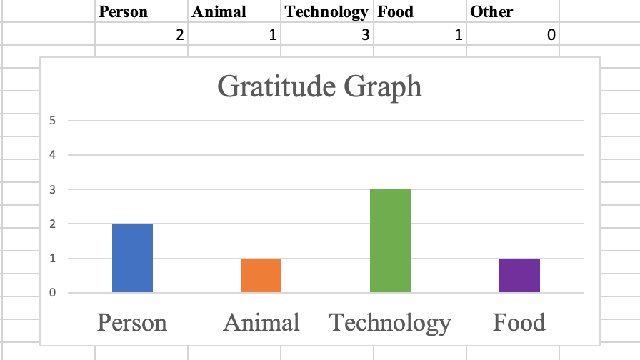
At the end of the week, count which category has the most items. For the gratitude graph shown here, technology was the most populated category, followed by people, then pets and food.
Examining the Experiment:
In this activity, we reflected on what we are grateful for. Research in positive psychology suggests that reflecting on what makes us thankful increases feelings of happiness and life satisfaction. This activity also allows educators to introduce a simple method of data visualization – the bar chart. Understanding how information is graphed and the ways in which information can be presented are important information literacy skills in the 21st century.
Science Extension:
This method of data visualization does not use a computer, however, using simple data spreadsheets, like Microsoft Excel or Google Sheets, we can create simple graphs. To do this, make one column for each category and fill in the count for each category below the title. Highlight all the cells. Select Insert along the toolbar, and column graph. You can play with the column colors, fonts and axis-increments to make the most appealing graph. This is a fun way to introduce simple data entry and visualization to kids.
STEMSpark Stumper
Other than a bar graph, can you think of a different way to depict the data collected by the class?